A new era for UTC Mank starts.
UTC Mank is the local tennisclub of my hometown. It is a place i hold dear to my heart. Over the years, the club has become smaller and smaller, pitches have disappeared into weeds and membership numbers have shrunk drastically. But now a group of volunteers has come together again to breathe new life into the club. So I wanted to do my bit and gave the club a new face.
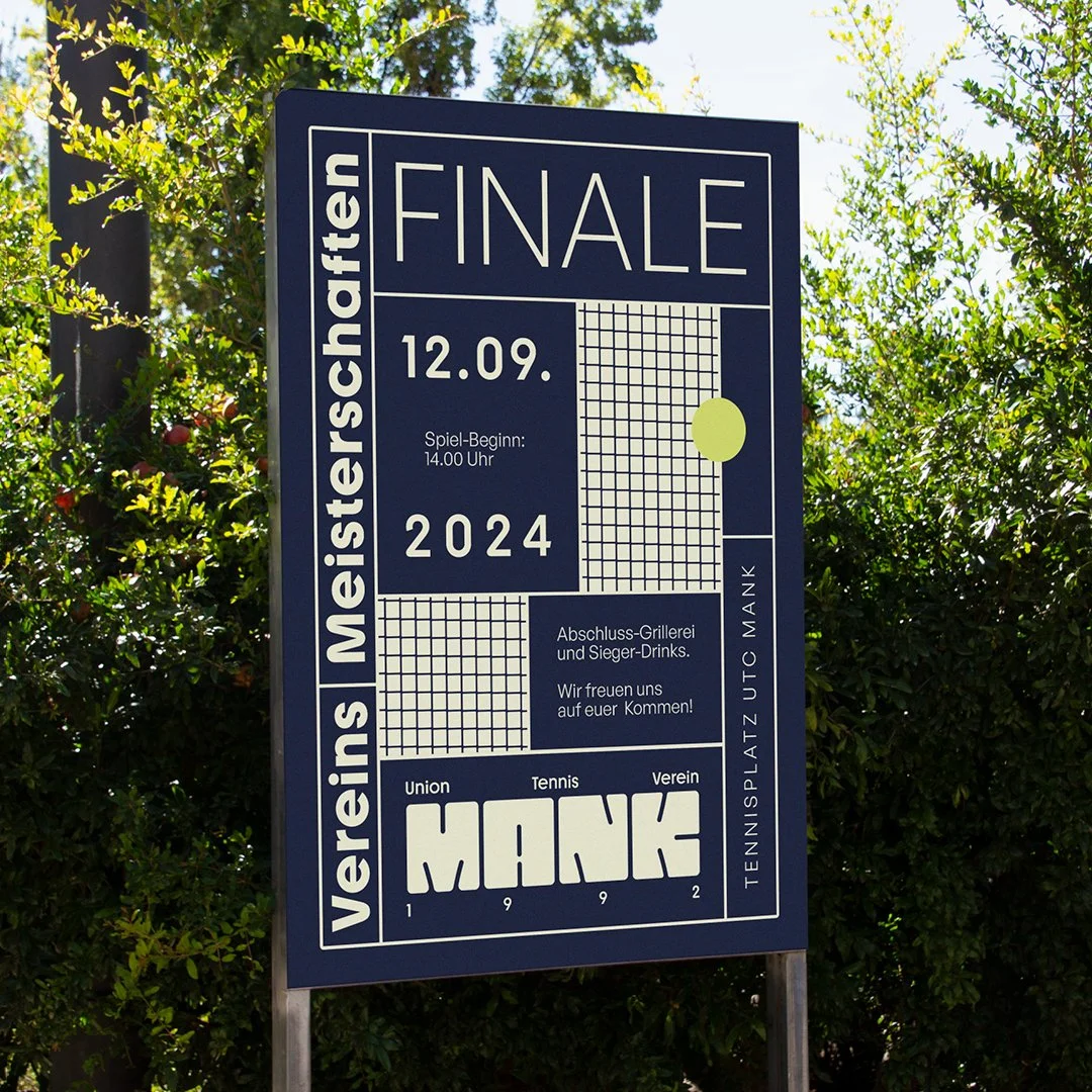
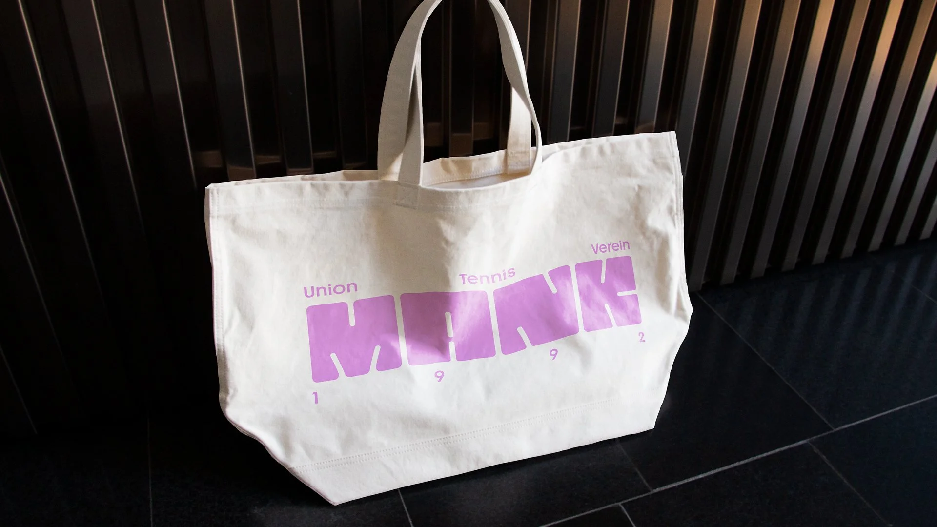
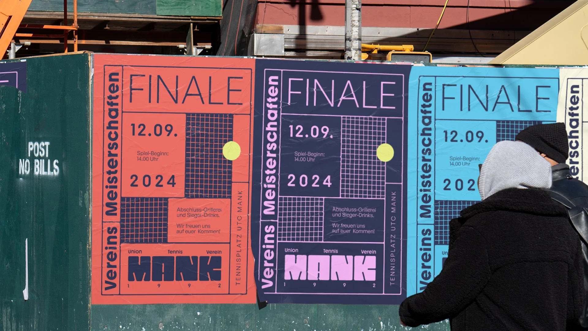
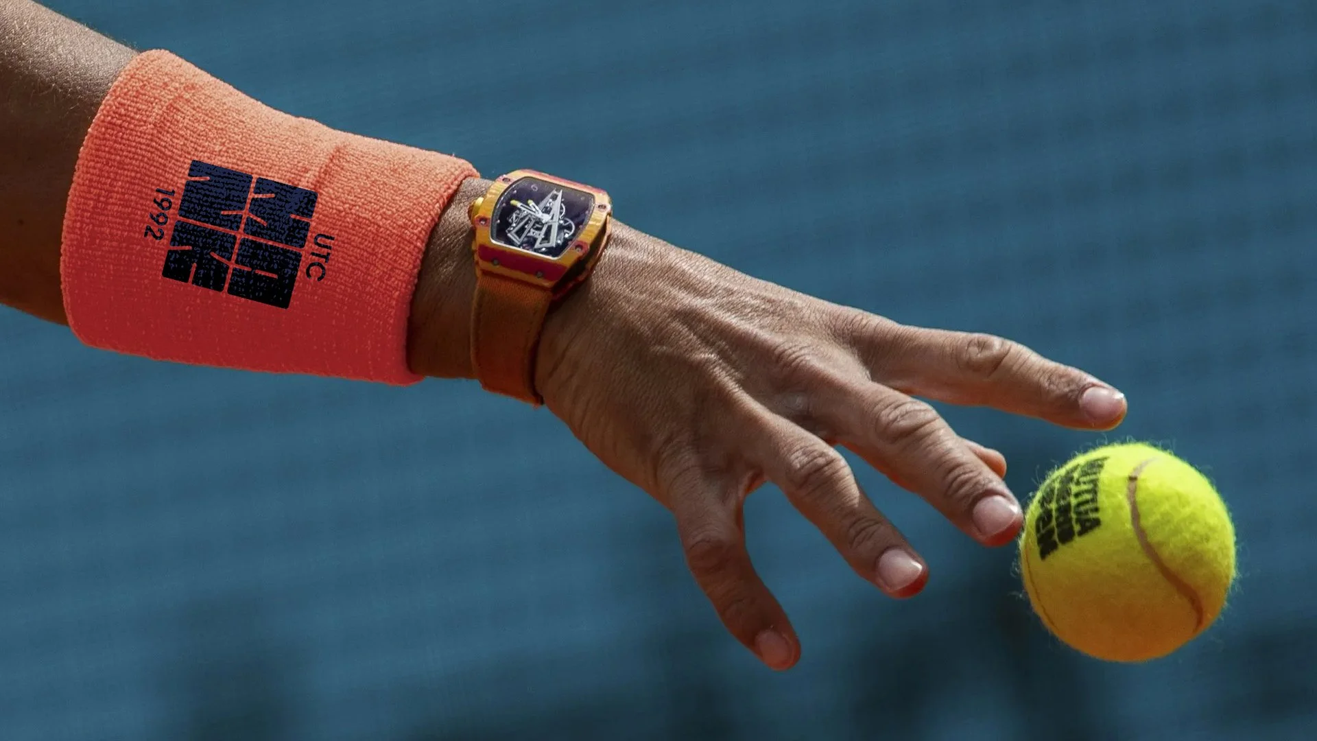
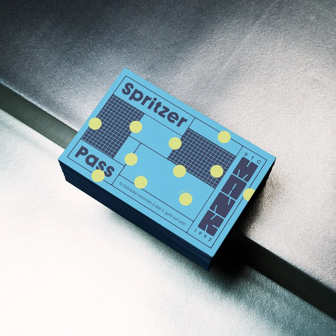
The rebranding is a homage to the good old days, which are now coming back. Two courts and a small clubhouse - that's all it takes to have a good time with family and friends. The two courts have been transformed into a unique typography that is both playful and quirky, but also reflects the retro charm of the facility.
The logo is just the centrepiece of a customisable identity. The layout grid of each asset is based on the layout of a tennis court making it easy an fun to use. The goal was to create a grid that is even easy to use for graphic design rookies as the members of the club should be able to design their own assets.

original logo


Client
Union Tennis Club Mank (voluntary project)
Credits
Concept+Creative Direction: Theresa Kerschner